Luxury ecommerce design: selling what customers can’t touch
Online, the customer can’t touch, smell or try anything. What takes the place of the hand and the eye.
5 min read
A high-end store sells through five things: photos that show the material, controlled type and space, product pages that answer before the question, flawless mobile speed and a frictionless checkout. Google considers a page good when its main content appears in 2.5 seconds or less.
Online, customers can’t touch, smell or try anything. Everything that happens through the hand and the eye in a boutique has to happen on screen. It all starts with identity: a store can’t be more coherent than the brand it carries, which is why branding for brands that sell online comes first.
1. Photos that do the salesperson’s job
Show the material up close. Show scale, in a hand or a room. Keep the same light from one product to the next. Place the product in its world without letting the world steal the show. Art direction set early costs less than reshoots.
2. Space and type: silence is part of the message
A high-end brand doesn’t shout. White space guides the eye and gives value to what remains; a page crowded with banners says “sale” before anyone reads it. Choose one or two typefaces and a few weights, then test them on a real phone.
3. A product page that answers before the question
| Element | What it should do |
|---|---|
| Photos | Show material, scale and use |
| Name and price | Visible without searching |
| Description | Tell the story, then add detail for those who read on |
| Materials and dimensions | Be precise |
| Care | Say how the product will last |
| Shipping and returns | Be clear before the cart |
| Buy button | Stay visible without scrolling on mobile |
4. Help people choose what they can’t touch
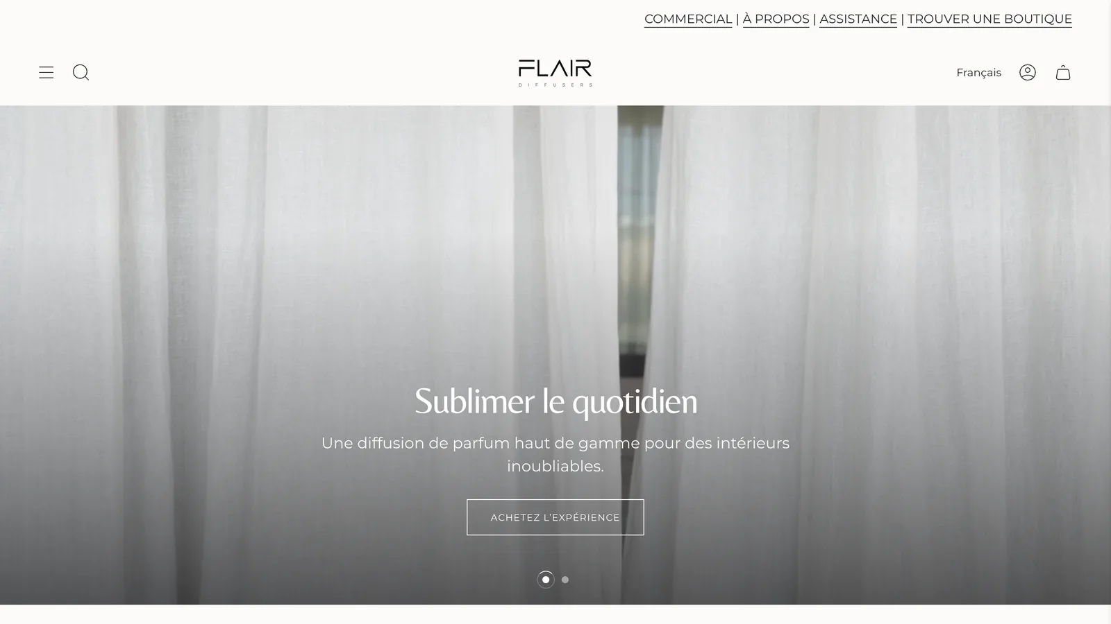
For Flair, a Quebec home fragrance brand, we designed a fragrance quiz, a collection inspired by grand hotels and a set builder. Customers can’t smell the scent, but they understand the mood it creates. Between 2022 and 2025, Flair’s conversion rate grew 3.4 times.
5. Speed: luxury doesn’t wait
| Metric | What it measures | “Good” per Google |
|---|---|---|
| LCP | Main content display | 2.5 s or less |
| INP | Responsiveness | 200 ms or less |
| CLS | Visual stability | 0.1 or less |
Large images don’t have to mean slow pages: modern formats, sizes adapted to each screen and lazy loading do the work. Flair’s store shows its main content in 1.5 seconds on mobile, according to real Chrome user data from September and October 2026.
6. Mobile first, checkout last
Design for a screen a few centimetres wide, then expand. At checkout, avoid surprises: costs known before the cart, digital wallets, and a checkout that looks like the rest of the store.
What gives away an average store
A discount pop-up before the first product. Sale badges everywhere. Supplier photos. Rushed translations. Stacked apps.
FAQ
Can a premium theme work? For a product launch, yes. To stand apart over time, choose custom. Custom Shopify theme
Should there be lots of animation? No. Motion should guide the eye, not slow the page.
Are promotions off-limits? No, but keep them rare and deliberate.
A question about your project? Let’s talk it through. Write to us